ZBrush tutorial: Monster-size sculpting tips from the BBC's Planet Dinosaur
Mathew Cooling from Jellyfish Pictures shares his work flow for modelling the creatures from the stunning BBC TV series Planet Dinosaur.
Creating dinosaurs for a TV series can be a tricky process. In my experience, deadlines are tight and most of the time you only have one shot at getting the creatures right.
But with some basic planning and forethought, you can focus on creating the creatures - knowing that they will fulfil all the necessary requirements - and facilitating any changes that may be required.
Monsterous 3D modelling
At Jellyfish Pictures, while working on Planet Dinosaur, it was decided that the theropods (I sculpted 27 of them) should have scaly skin, which can be time-consuming.
So I planned a quick and simple character pipeline that would ensure consistent style across all the characters and enable artists to follow the same style.
This is an overview of the settings, brushes and steps we used to create the dinosaurs. I hope you can find something that will be of use to you.
ZBrush has been designed with creativity at its heart. Unlike a lot of 3D packages, ZBrush's work flow is not linear and is open to how you want to go about creating something. There are general guidelines but you're free to think of new ways to use the tools at hand. Experiment and try what comes to mind. Just as no single person will create something in the same way as another, knowledge and technique constantly evolves.
Know your system
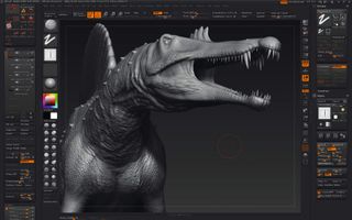
The Windows version of ZBrush is a 32-bit application, which means it can use a maximum of 4GB of memory (and some of that is saved for system operations). To see how that can affect you in practice, create a file and subdivide it as many times as you can, then add layers with PolyPaint, sculpted detail and mask information.
Get the Creative Bloq Newsletter
Daily design news, reviews, how-tos and more, as picked by the editors.
Now save the file and see what size it is. From my experience, if it's over a gigabyte in size, your system may have some issues opening it. (This will vary from computer to computer.) Even if your workstation can handle the overall file size or the amount of polygons that a SubTool has, it may still have issues generating an adaptive displacement or bump map.
If this occurs, you may have to create non-adaptive maps, which may not be as accurate or clean. There is another way around this, though, which I will cover in tip 6.
ZTools vs ZProjects
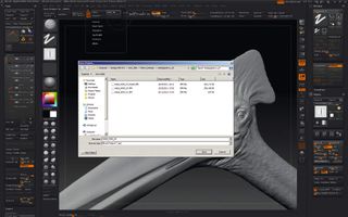
Saving a file as a ZTool gives you a clean, efficient file with only the model you have been working on. No space is wasted on information such as materials, time line and render settings.
ZProjects are very useful if you create a lot of preview renders, as render settings are saved and don't need to be reentered each time the file is opened. If used carefully, a ZProject will only be minimally larger than its equivalent ZTools. But the file can balloon if unused ZTools and OBJs are not cleared out after use.
To delete contained ZTools, you sometimes have to save a ZProject, load it up again and then delete the ZTools that are no longer needed.
Reference matters
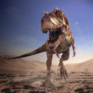
Even before you start sculpting, it's a good idea to search the internet for reference. There's a good selection of artists' interpretations of what a dinosaur could have looked like.
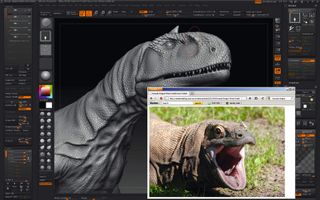
Tracking down photos of living creatures that have some characteristics of dinosaurs is useful, and should be a priority. Rhinos, elephants and reptiles in general give a good overview of how anatomy and skin type work on different shapes and sizes of creature.
Photos of birds are extremely useful: they're the nearest living equivalents to what a theropod (a bipedal, largely carnivorous suborder of dinosaur) looked like, just on a smaller scale. Birds such as the cassowary and emu have wonderfully theropod-like feet and legs.
Sculpting basics
If you want to learn the best way to sculpt characters and creatures, I heartily recommend the books by Scott Spencer, especially ZBrush Character Creation and ZBrush Digital Sculpting Human Anatomy. Scott gives a very thorough overview on how it should be done.
In the meantime, these are some basic techniques I have come to use:
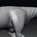
1. Keep the ZTool at a resolution that's no higher than you need for the kind of detail that you are applying. If you're adding form, for example, start at a low resolution: the brush strokes will be fast and accurate, and will help you get a nice, clean and smooth model.
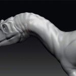
2. When adding form, use a relatively large brush size with a low intensity. It's better to define a muscle form with just two or three brush strokes rather than a few dozen. Don't be afraid to use the Move tool as well if you have to deal with large areas of reshaping.
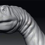
3. Try not overwork a stroke. Keep your arm relaxed and let the odd mistake happen: it could open your eyes to another idea. Sometimes your best friend in sculpting is the happy accident. A relaxed stroke will also give a more organic, natural feel to the sculpt.
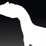
4. View what you're sculpting as a silhouette at regular intervals: it's the best way to see exactly the form you've just applied. Don't just rely on the angle you're sculpting at.
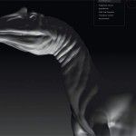
5. Use the Interactive Light, which can be found in the Zplugin palette, to get a real-time idea of how light will play over the surface. Always use this function when the model is being viewed with a Standard material.
Layers
Layers are a useful feature to use when applied logically and carefully; otherwise, they can become convoluted and increase the file size considerably. Layers hold PolyPaint, sculpting and masking information, but no material information. Materials need to be applied without a layer selected.
My preferred way of working is to subdivide the model to the highest level that I want to work on, then create the layers on that level.
Creating layers on a lower subdivision means that if you delete a layer, all the sculpted detail on higher subdivisions is still present on the model. If you choose to use HD Geometry, you will be left with faint detail once a layer has been deleted or hidden.
To keep layers efficient, a good working practice is to break your hierarchy into specific uses and to name each one simply. Use as few as possible to keep things straightforward and easily manageable. For creatures, I break my layers down along these lines:
Pose
Keep a layer for posing your dinosaur's mouth or eyes. If the dinosaur is built with its mouth closed, open it with Transpose and the Transpose Master plug-in to move the teeth and tongue, so they fit perfectly into the jaw. Create a Pose layer on the teeth and tongue SubTools. If you don't want to use SubTool Master, you can use Stroke > Replay Last to apply the last stroke or movement you did to different SubTools. Posing the jaw means you can get inside the mouth with ease. After you've fi nished sculpting, hide the layer so the rigger has a model that's easier to work on.
Form
As the name suggests, this layer is where the majority of the sculpting is done. Focus on proportions, form, position, joint pivots and facial features. Work on the lowest subdivision level you're comfortable with.
Wrinkles and folds
Once you're happy with the dinosaur's form, start to add the larger skin folds and wrinkles. Keeping these separate means you can hide this layer when adding smaller details such as scales and skin: you'll get less stretching when applying fine detail in complex areas like the neck, when this layer is hidden and you're just viewing your form layer.
Again, this should be done on not too high a subdivision level. It helps you keep the model topology evenly spread: neither overly dense in some areas nor stretched out in others, which can occur if you use the Pinch brush a lot. You can also turn off this layer when you are sculpting scales: with it hidden, the textures will distort less when applied.
Scales
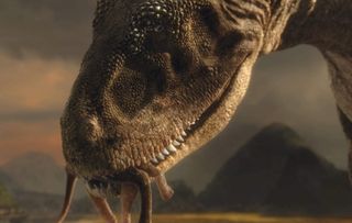
If you're working on a theropod, it's probably going to have scales - which can be time intensive, especially on the head, hands and feet. You can normally speed the application of small details up by using the DragRect stroke with different brushes and alphas, Projection Master or Spotlight. Keeping general scales on one layer makes it easy to backtrack if need be. Sculpted form or detail can easily be removed from layers by using Morph Target and the Morph brush, which I cover in tip 7.
Large scales and design features
Keeping larger scales and more specific design elements on separate layers means that you can easily backtrack. Even though you would create the smaller scales first, you can overlay larger scales without the smaller scales coming through by using the Smooth brush on the fine detail in areas such as the back or brow. Sculpt in the larger scales in that area and then use Morph Target and the Morph brush to bring back the small scales you smoothed out earlier.
With feet and hands, it can be a good idea to place down the larger scales before sculpting the smaller scales. It's easier to control where the smaller scales stop when they come up against a larger scale than trying it the other way around.
Scars, etc
Once the dinosaur is looking detailed enough, you can add bite marks, old scars, pitting, damage to horns and scuffs. If you started off with hand-created, clean-looking scales, this stage will make the dinosaur look more natural and organic.
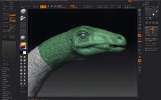
HD Geometry
On Planet Dinosaur, we used HD Geometry: it was the most straightforward way to get the ZTool to a high enough subdivision to apply details like scales. (The other way would take up a few pages on its own.)
HD Geometry is easy enough to use. You simply open Tool > Geometry HD and press DivideHD. HD Geometry doesn't work seamlessly with layers, though: any sculpted detail created on a subdivision higher than the level the layer was created on is not stored in that layer.
So when you turn off a layer, you get the ghost of sculpted detail created in a higher subdivision. It's good practice to specify the part of the model you want to work on in HD using PolyGroups.
Make sure that the polygon total is within what ZBrush says your system can handle. The idea is to have a nice straight separation when ZBrush takes the model into HD.
Now and again the HD process can leave you with small but sharp edges, and it's a lot easier to find and clean them in Photoshop. Again, Morph Target and the Morph brush are useful, so save a Morph Target each time you are about to go into HD.
When using HD Geometry, take into consideration that for ZBrush to be able to view the large amount of polygons, it will temporally disable UVs, so you can't apply a seamless texture from using the model's UV layout and selecting Tool > Displacement Map > Apply DispMap.
Alpha variations
For Planet Dinosaur, I created a basic selection of brushes and alphas for each part of the detailing process. The general scale alpha was created in Photoshop as a tileable, solid black-and-white scale pattern.
In Photoshop, create the scales in two layers, then give the scales a bevelled edge using the Outer Glow layer style set to black. Take this bevel to almost the centre of the medium-sized scale so it's almost entirely a gradient.
Even if you want the scales to be flat-topped, you can change the AlphaAdjust curve in the Alpha menu to flatten out the gradient so it's white and flat.
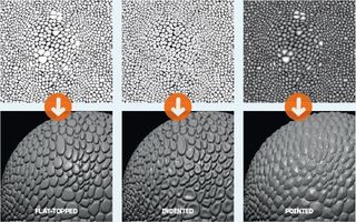
Having this gradient means that you can take a simple, clean alpha and create a varying array of scale types, such as flat-topped, indented or pointed.
Deformed alphas
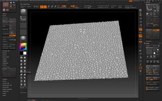
To get more variation with a scale alpha (or any other alpha), you can apply them to a subdivide planar in ZBrush, then deform the planar using the Move brush; use any of the deformers in the Tool palette and grab the Z-depth when you're happy with the effect. To do this, try these steps:
- Add a Plane3D Tool and select Make Polymesh3D. Deactivate Smt in the Geometry palette. Divide several times until the geometry is dense enough to handle the detail.
- Create a new texture in Tools > Texture Map; it doesn't matter what size.
- Import the alpha and load it as a displacement map. Set the displacement map intensity at a low setting or until you like the look of it.
- Select Displacement Map > Apply DispMap.
- Save the Morph Target via Tool > Morph Target > StoreMT. At this stage, you can distort the flow of the scales so they can move with a section of the body or increase in size in places. Inflating the plane that has the applied detail can give you different effects; it also ensures that the plane stays flat and subsequently produces a clean alpha.
If you want the alpha to tile, keep the edges of the plane as close to their original shape as possible. As you have saved a Morph Target, you can achieve this by using the Morph brush.
If you've pushed out from the centre of the plane with the Move tool and the plane won't snap nicely inside the Document window, you can simply switch back to the saved Morph Target.
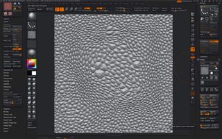
To capture the new detail from the plane, follow these steps:
- Turn off Pro in the Document palette and create a 1K- or 2K-sized document. Place the detailed plane onto the canvas and select Edit mode.
- Turn off Perspective Distortion to the right of the canvas. Make sure the plane is fl at onto the canvas by [Shift]-clicking it.
- If you want to capture all the detail on the plane, click the Frame button to the right of the canvas. Otherwise, just scale the plane until the detail you want to capture is visible at the desired resolution. Make sure that all the canvas area is taken up with the plane.
- Select Alpha > GrabDoc.
Brushes and Projection Master
The basic technique for placing down large amounts of detail quickly is to use the Standard brush with the DragRect stroke. Using DecoBrush in Projection Master can give you natural flowing detail that works with the contours and forms of the dinosaur.
As always, save a Morph Target before you do this: when you come out of Projection Master, you can fine-tune and clean up the detail you've placed down. To ensure that you only apply the detail where you want it to be, mask off everything else.
For best results, select Double Sided, Deformation and Normalized in the Projection Master dialog. If the alpha you are using is tileable, activate Tile Texture in the DecoBrush Modifi ers.
You may not get the desired effect with the fi rst stroke of the brush, so redo it until you get something you're happy with. If you only like a small section of the stroke, erase the rest using Morph Target once you come out of Projection Master.
When you use Projection Master, ensure that the scale of the model you've placed down is enough to allow the detail applied. If the model is too small on the canvas, you will get pixellated detail.
A slow part of the detailing process is blending different groups of alphas together. There are different ways to do this. One is to mask off the scales by hand, then use the Clay brush to bring the new scales up.
The other is to use the Clay brush with a depth of 4 to draw in the scales between the existing groups of scales. ZBrush was designed to provide many ways to do a task; if you discover a new way to do something, give it a go!
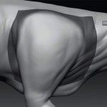
1. Select the part of the model that you want to take into Projection Master to apply detail. Go into HD Geometry and mask off the edges.
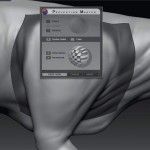
2. Position the model part so that it's large on-screen, then select Projection Master. Enable Double Sided, Deformation and Normalized.
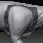
3. Select DecoBrush. Turn on Tile Texture in the Modifiers that appear once it's selected.
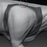
4. Apply the DecoBrush stroke on your model part - watch out for pixellated details.
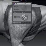
5. Once you're happy with the look, pick up the model in Projection Master. Erase parts of your stroke using Morph Target if you prefer.
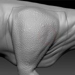
6. Apply the detail to the model. The mask you created at the start means the scales appear only where you choose.
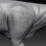
7. Use the Morph brush to add variation to the strength of your applied scales for additional textural interest.
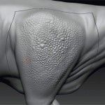
8. Use the hPolish brush with a Depth > Imbed setting of 4 (instead of -4). Use a small brush size and fl atten off some scales.
Skin details and wrinkles
One brush I've found extremely useful is the Track brush combined with Alpha58. Change the Alpha settings so that MidValue is 0, use a low brush intensity and try varying the alpha's Blur strengths to get different effects.
Apply the brush stroke in different directions on the model with the form and joint movement in mind to get a natural feel. Laying down the detail is just the start of the process.
Once it's placed down, it's time to work into it using whatever brush you think will do the job.
The Form and Infl ate brushes can give a nice soft feeling. This can be fine-tuned using Cavity Masking. If the scales you've previously placed down are giving an undesired effect when using the Cavity Mask, you can simply hide the scale layer and re-generate the mask.
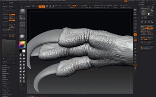
Exporting maps and creating clean cavity maps
Once you've got the dinosaur where you want it to be, it's time to export the maps to be rendered.
You will need to export specific maps to match your chosen renderer. The basic maps we used on Planet Dinosaur from ZBrush were bump, displacement and cavity.
From these, other maps such as diffuse, dirt and specular were created using BodyPaint 3D and Photoshop. These three maps can be useful when using Mari to paint textures.
Displacement maps
These are straightforward to export from ZBrush. The basic settings to be used in the basic map generator or the Multi Map Exporter plug-in are the same.
Selecting Adaptive, FlipV, 3 Channel and 32Bit does the job for the renders I've mentioned. Issues can arise after selecting SmoothUV when a UV border cuts across a vert with more than four edges connected to it.
This issue can also arise when SmoothUV is not selected, so it's best to cut UVs away from these verts.
Bump maps
For most renders, it's OK to use the same settings as for displacement maps - but select Create DispMap, which keeps the map in ZBrush. If you're not using Multi Map Exporter, Clone Disp sends the alpha to the Alpha palette. Once it's there, you can apply FlipV if needed and export.
Make a note of the alpha depth factor and include it into the image fi le name. This informs the person who is rendering out the character and maps what intensity to set the bump map at. For them to use this number, it's a case of multiplying the value by 100 to get the bump strength.
If you're using Arnold Renderer, as we did for Planet Dinosaur, make sure that all the bump maps have the same alpha depth factor, as Arnold can only handle one UV set. This can be done in Multi Map Exporter by setting the Scale slider higher than 1.
Even though ZBrush can calculate what the scale should be, I find in most cases that a setting of 1.5 will give a usable map, where neither blacks nor whites are clipped. Try different settings to see what gives you good contrast in the image without the clipping.
Once the maps are exported, they can be pasted together in Photoshop and work when rendered, as they will be the same strength.
Cavity maps
If you use the basic Displacement Map Exporter, you can create a clean cavity map by selecting the Basic Material 2 and Crop and Fill, and dropping the alpha onto the canvas. Once the alpha is dropped, make these changes to the Material settings:
- Ambient: 100
- Diffuse: 100. You can set this to any strength to fine-tune the final map
- Specular: 0
- Cavity Intensity: between 100 and 200, or whatever gives the right amount of coverage
- Cavity Radius: between 1 to 4 to achieve the result you want
- Cavity Colorize: 1
Turn off Shadows in the render settings and select Best Render. Once rendered, select Document > Export and save out the fi le. If you use Multi Map Exporter, you have to change the image to a greyscale image in Photoshop and save it as a PSD if it isn't already. Load it back into ZBrush and follow the render and export steps above.
Was this tutorial useful? Let us know in the comments box below!
Written by Mathew Cooling

Thank you for reading 5 articles this month* Join now for unlimited access
Enjoy your first month for just £1 / $1 / €1
*Read 5 free articles per month without a subscription

Join now for unlimited access
Try first month for just £1 / $1 / €1
The Creative Bloq team is made up of a group of design fans, and has changed and evolved since Creative Bloq began back in 2012. The current website team consists of eight full-time members of staff: Editor Georgia Coggan, Deputy Editor Rosie Hilder, Ecommerce Editor Beren Neale, Senior News Editor Daniel Piper, Editor, Digital Art and 3D Ian Dean, Tech Reviews Editor Erlingur Einarsson, Ecommerce Writer Beth Nicholls and Staff Writer Natalie Fear, as well as a roster of freelancers from around the world. The ImagineFX magazine team also pitch in, ensuring that content from leading digital art publication ImagineFX is represented on Creative Bloq.
